Hockey Québec
Logo & Brand Identity
"A mark
designed
to be worn."
For Hockey Québec, the mandate wasn’t to reinvent the sport but to realign the institution behind it.
The work focused on the core: a refined logo within a flexible system, and a colour palette built to carry meaning across every level of the game.
The identity needed to balance heritage and modernity. Authority and accessibility. Provincial scale and local pride.
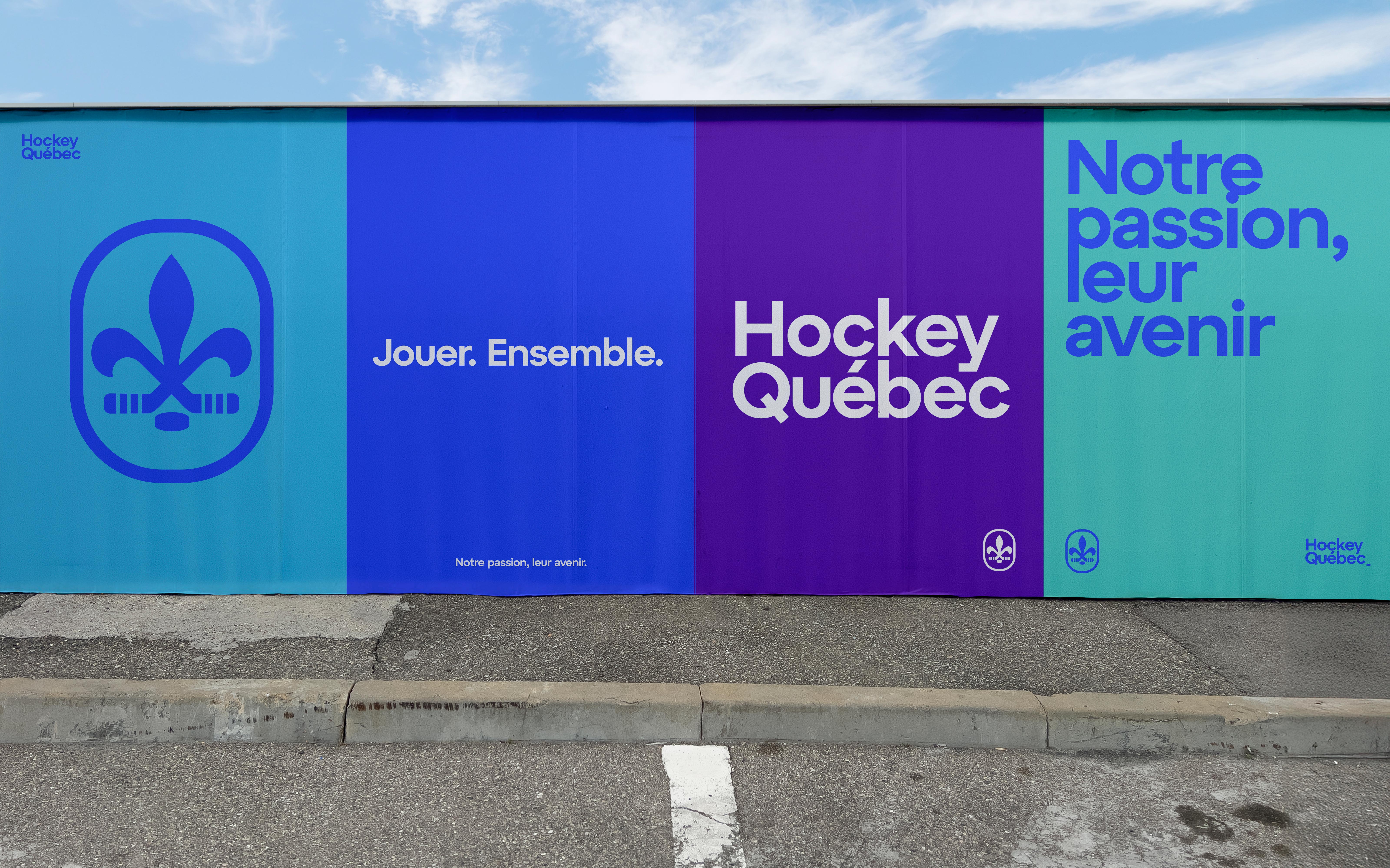
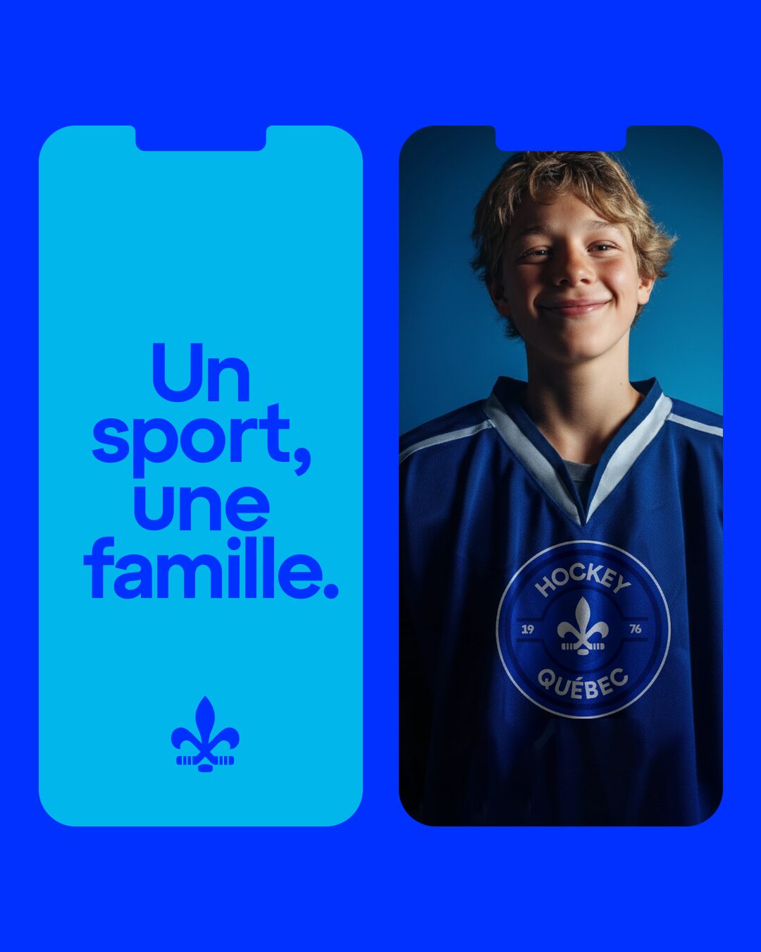
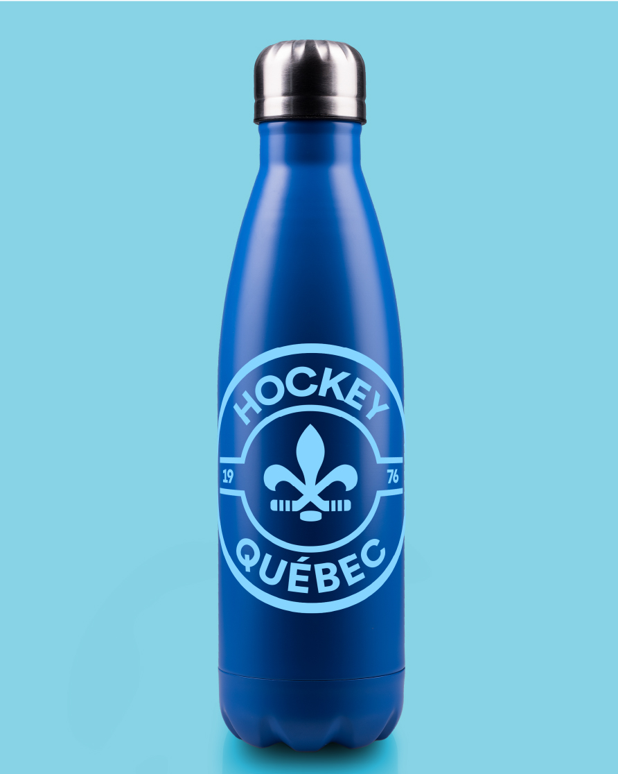
We simplified the mark to strengthen recognition, built a modular system adaptable to regional names and audiences, and clarified how the identity holds across print, digital, apparel, and rink-side environments.
Nothing decorative. Everything intentional.
Built to last, season after season.
When the system is right, the game speaks for itself.
Client
Hockey Québec
Category
Community Organization
Services
Logo & Brand identity
Credits
Project Lead: Agence Substance x Area.Studio
Creative Direction: L. Chapdelaine,
Art Directon: L. Chapdelaine, C. Duclos
"Designed as one mark for the boardroom table and the jersey in front of thousands"


A WORLD OF POSSIBILITIES
INQUIRIES & OPPORTUNITIES
info@area.studio
Subscribe to our news feed if you want to hear about us from time to time.
QUEBEC, CANADA
© Area.Studio — Create.Transform.Elevate.